I downloaded the game while it was free for a couple of days. I promptly tweeted about that; make sure to follow me to not miss these opportunities!
I really enjoy the overall atmosphere and the mechanics of the puzzles. Unfortunately, it looks like most of the development effort went into the aesthetics and too little on usability testing.
The premises are a bit of a stereotypical B-movie plot, which doesn't make them less appealing. You are an explorer trapped in a pyramid, and need to use a beam of light to advance through it. Everything is presented in a top-down perspective view, rendered in full 3D, though the 3D is only for presentation because the puzzles are strictly bidimensional.
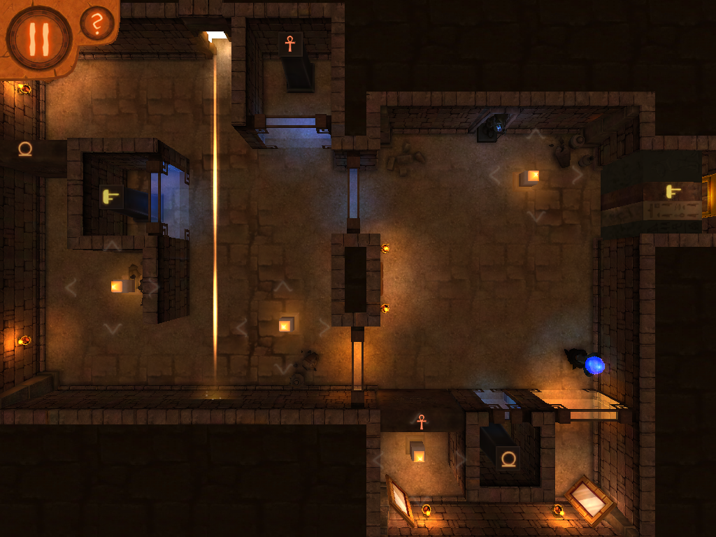
To control the beam you use some poles which, when struck by the light, can deflect it in any direction. There are also mirrors on the walls, which are fixed in place and can only be used to reflect the beam at a fixed angle.
In the image above you see two types of poles: the one in the center can only be rotated, while the other two (the most common) can both be rotated and moved around. There is also a third type which splits the beam in two.
When moving poles around, you are constrained by the environment. E.g. if there is a closed door, you can't move a pole through it unless you first open the door.
After warming up for a few levels, the game introduces its main mechanic: when the beam hits the blue orb, you can tap the button on the bottom left and enable an "alternate plane" of light. That starts a beam of blue light, and transforms the screen from this...
... to this.
There are two things to note in that image. The first is that, contrary to common physics, the blue beam cannot cross the yellow beam. So in the above example, to let the blue beam reach the left of the screen you'll need to make the yellow beam hit the orb from the other side.
The other thing to note is that when the alternate plane is enabled, three green scarabs appear. Your secondary objective is to touch all three scarabs at the same time with the blue light. When you do that, you'll learn more about the pharaoh's story, and if you do it for all levels you'll get a different ending at the end of the game.
As the game progresses, the levels become more and more complicated, containing glass doors that can only be crossed by light of the same color, and lots of switches to trigger. It's important to note that switches are of two different kinds: ones that need to be kept lit to keep the door open, and ones that need to be hit only once to permanently open the door. That's crucial to allow progression through a level.
There are 28 levels in total, but if you're thinking that's not many, think again: completing a single level requires many steps and takes several minutes. If you go for all three scarabs (which you definitely should), even more.
Having long levels is great, but in this case it's also a problem because your progress isn't saved: every time you launch the game, it starts again from the intro, and you have to go through the level selection menu, restarting the level from the beginning. This is an incredible oversight for a mobile game, and extremely annoying. Essentially, when you start playing, you'd better make sure to have enough time to finish a level.
But as annoying as that might be, it pales in comparison to how frustrating the controls are. Directing the beams often requires extreme precision, which is very hard to achieve given how the controls have been implemented.
First of all, every time you touch a pole the direction of the bem is reset to the position of your finger, which makes it impossible to do incremental adjustments. Second, as soon as you lift the finger, more often than not the beam direction will be altered, messing up your alignment and forcing you to do it again.
I'll not even mention how often you move a pole instead of rotating it, or the other way around, or you pick the wrong pole when there are two next to each other. Those are minor issues compared to the one above.
And all this is while playing on iPad Mini. I can imagine that the game must be totally unplayable on iPhone.
This is a huge issue. Such poor controls wouldn't have been adequate for an early prototype, let alone a published game.Since I'm not the only one to complain about this, I would have expected the developers to hurry to fix it. Instead, the only update in the past six months was just to add more languages.
I like this game, I really do; but I can't recommend spending money on it unless the controls are improved.
Summary
| Nontrivialness | ★★★★☆ |
| Logical Reasoning | ★★★★★ |
| User Interface | ☆☆☆☆☆ |
| Presentation | ★★★★☆ |
| Loading Time | ★☆☆☆☆ |
| Saves Partial Progress | ✘✘ |
| Status Bar | ✘ |
©2014 Nicola Salmoria. Unauthorized use and/or duplication without express and written permission is strictly prohibited. Excerpts and links may be used, provided that full and clear credit is given to Nicola Salmoria and nontrivialgames.blogspot.com with appropriate and specific direction to the original content.


